Marketing website banners capture the attention of your visitors and encourage them to take action. If you want to advertise new products, then you need quality content and creative designs. Let’s discuss how you can create effective marketing website banners.
What is a marketing website banner?
Website banners are digital advertisements that you can showcase in different parts of your website. You can use them to present your products and services to your audience. Marketing banners also let you promote your brand and reach a wide range of users. So, a technically balanced marketing banner can engage your potential customers and increase the revenue of your business.
Why design of a marketing website banner is important nowadays?
You see a lot of ads every day while browsing the World Wide Web or the internet. You do not remember all of them but some advertisements capture your attention and stay in your memory lane for a long time. Do you know why? Because those ads are interactive and have some valuable information.
Running online advertisements is not sufficient in the current times. All the brands are advertising their products and services. So, you cannot overshadow them and show the worth of your business only by showing some random ads.
You have to work on the marketing content and visuals. Your advertisement should focus on a particular audience instead of targeting everyone. Once you have a buyer profile, your ads can boost the engagement rate of your business. So, what are the latest trends? Check the given points.
- Video graphics, because it’s gaining popularity and is a preferred choice for all the viewers.
- Graphic design to show the mission of our business
- Abstract figures with round shapes and sharp corners
- Multimedia images and 3D elements
- A mixture of vintage and modern designs
- Personalized offers for each set of visitors
- Simple and minimalistic information transfer
- Speed is the most important factor. You should launch the advertising quickly, update the banners frequently, respond to the needs of your audiences, and adjust your marketing strategies.
How to create a marketing website banner?
Marketing website banners are perfect if you want to make a statement for your brand or show new offers to your visitors. But, you cannot create a banner by chance. You have to design it strategically, according to the market standards. Let’s talk in detail.
1. Define your targets and goals
Why do you want to create a marketing website banner? What is your purpose? You can use the banners for several projects.
- To increase the recognition of your brand.
- Rebranding your business to change its image in the minds of your consumers
- Advertise new or flagship products
- Promote sales
- Discover the audience for an event
- Strengthen the identity of your brand
- Let your audience know about your social initiatives
Once you decide your goal, the next step is to determine your target audience. Who will see your banners? In case you do not have a buyer profile, create it.
Who are your ideal customers? Describe them in detail, including their hobbies, interests, work, etc. Once you create a buyer persona, you can easily create website banners for them.
Detailed description about your buyers increases the engagement rate of your website because responses to a relevant message are always high. In addition, it helps you to be creative and develop new ideas.
2. Research your competitors
The next step is to analyze your competitors. Which design they are using? Who are their target audience? What types of advertising they are designing? This information gives you a foundation to build effective marketing banners.
3. Write your message
Your headline should act like the tip of the iceberg, a teaser to the actual movie, which can encourage your visitors to click on the CTA link or button. Once the users click, they can see the whole content. So, consider the given points.
- What is your message for your visitors? – Write it in crisply and to the point
- What is your proposal? – Is it a piece of news, promotion, new offers, or something else?
- Once you are ready with the headline, is it easy to read and understand?
4. Design
You have to be creative in this step. But, you also have to remember some rules while selecting the colors because it’s one of the most crucial aspects of your marketing banner. Do you know users create an opinion about a banner within 90 seconds? Around 70 to 85 percent of decisions are made due to the colors. Let’s talk a detail.
Colors
The choice of colors differs according to the individual. However, there are common rules about them. The impacts of your marketing banners are defined by these perceptions.
- Red: Love, excitement, passion or anger
- Brown: Modesty, firmness, courage, seriousness, leather, wood, nature
- Pink: Feminine, children, love, sweetness
- Purple: Creativity, magic, wisdom, extravagance, royalty, luxury
- Blue: Courage, coolness, refreshment, formality, intelligence, calmness, maturity
- Yellow: Friendliness, sunlight, cheerfulness
- Black: Luxury, prestige, power, modernity, purity
- Gray: Practicality and Neutrality.
So, you choose the colors as per your business type and the impression you want to create on your visitors. It’s crucial to pick appropriate shades because they play a significant role in determining your banner’s fate.
Text
Your visitors will not spend more than a few seconds reading the content of your banner. So, your text should be easy to read and understand. Follow the given steps.
- Pick the right font: Select a clear font, so that all your visitors can read it even on small screens. The font should match the style of your banner. Prefer headlines for 36 pt and sub-headings or other content at 16 pt.
- Limited fonts: Do not use a variety of fonts on your banner. Maintain smoothness.
- Color: The test color should contrast with the background. Your brand’s appearance should also match the shades of your banner.
- Keep it simple: Do not use long sentences and complex words. Use simple-to-understand phrases.
- Test the fonts: Check the fonts on all the devices before you publish the banner. The text should be visible clearly on smartphones.
Images
Use relevant graphics and images. Do not use low-quality or blurred photos. Otherwise, your banner might fail. If you do not want to hire a professional photographer, you can use Canva to design graphics. You can also use stock photos.
Plugins like WP Announcement give you free templates to use. So, you can design website banners without looking for images or designing new graphics. But, if you can use stock images or generate graphics, it also lets you add custom-designed banners.
You can design a banner even without an image. A relevant message and a CTA can also give you results, especially if your text is catchy, the content has a relevant message and the typography is clear.
Animations
Animations and videos are some of the successful ways to grab the attention of your visitors. However, do not add a long animation video. Keep it within 15 seconds. Also, do not use heavy reactivity in the animations. Otherwise, it will slow down your website.
Call to action (CTA)
A CTA button encourages your visitors to take some action, so it should be visible. Use phrases like Buy Now, Shop Now, Learn More, Claim Now, Check the Price, and similar texts to catch the attention of your potential buyers. The CTA text depends upon the nature of your business and your motive.
- What do you want from your visitors? Do you want them to subscribe to your newsletters?
- You want them to check the latest updates about your business.
- Or Are you willing to offer some products at discounted prices?
Regardless of your goal, keep the CTA clear in your marketing banner.
5. Design a marketing banner
You can use WP Announcement if your websites are built on WordPress. It deserves your attention because of the following reasons:
- WPA lets you select from a wide range of pre-designed templates and also allows you to use custom-created banners.
- You can select the height of your marketing banners
- Customize the banners as per the look and feel of your website. You can change the background color, fonts, font color, and much more.
- Decide the placement of the banners
- Has a user-friendly interface. You can use it even if you are a beginner
- Add a countdown timer on the banners to induce urgency
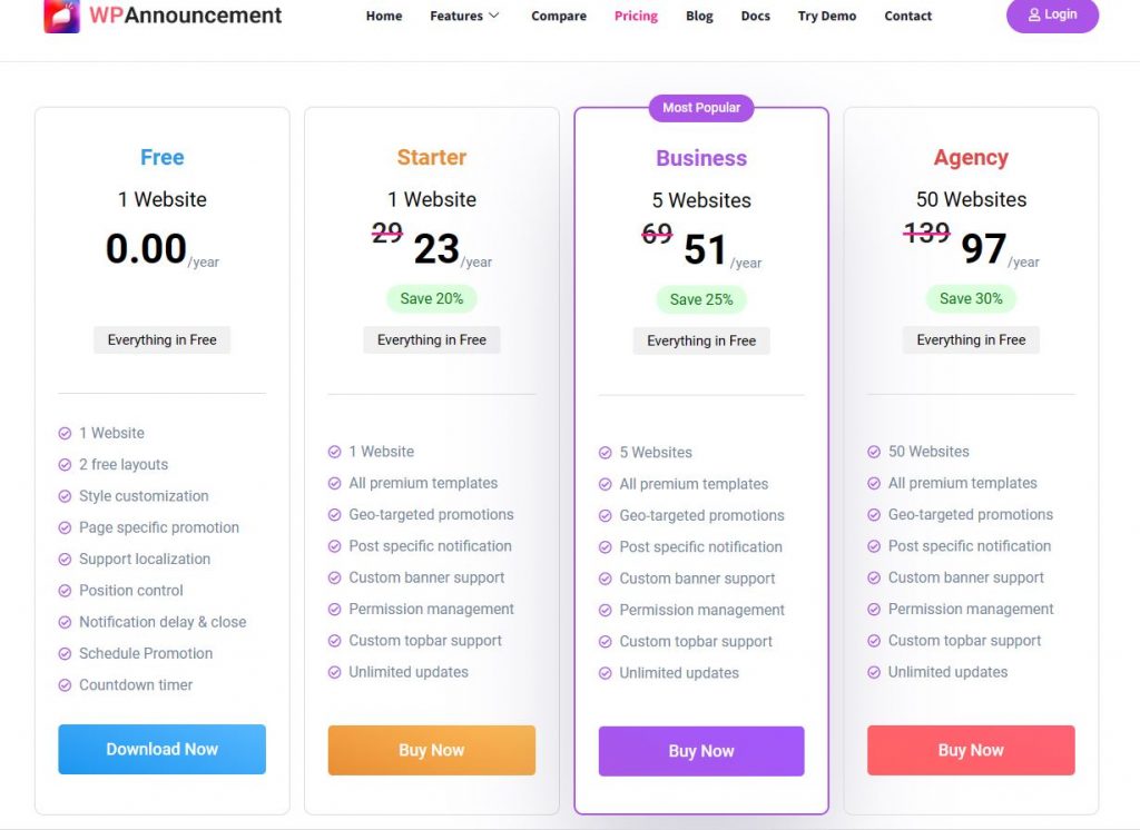
- Free to use. The premium editions are also available at affordable prices.
Step 1: Download WP Announcement from its official website. Install and activate it on your WordPress panel. You can go for the free version. Upgrade if you enjoy the features of this extension.
After activating the plugin, it shows a new option on the left side menu of your WordPress panel, Announcements. Click on this option and select Add New.
Step 2: Select a template
WPA has several different types of pre-designed templates. Look at the options and pick something that suits your website, business type, and motive. Once you select one of them, check the next step.

Step 3: Click on Content from the left menu. Change the banner’s text and CTA (Button URL) from this section. You can also select to show several messages after a few seconds from the Message box.
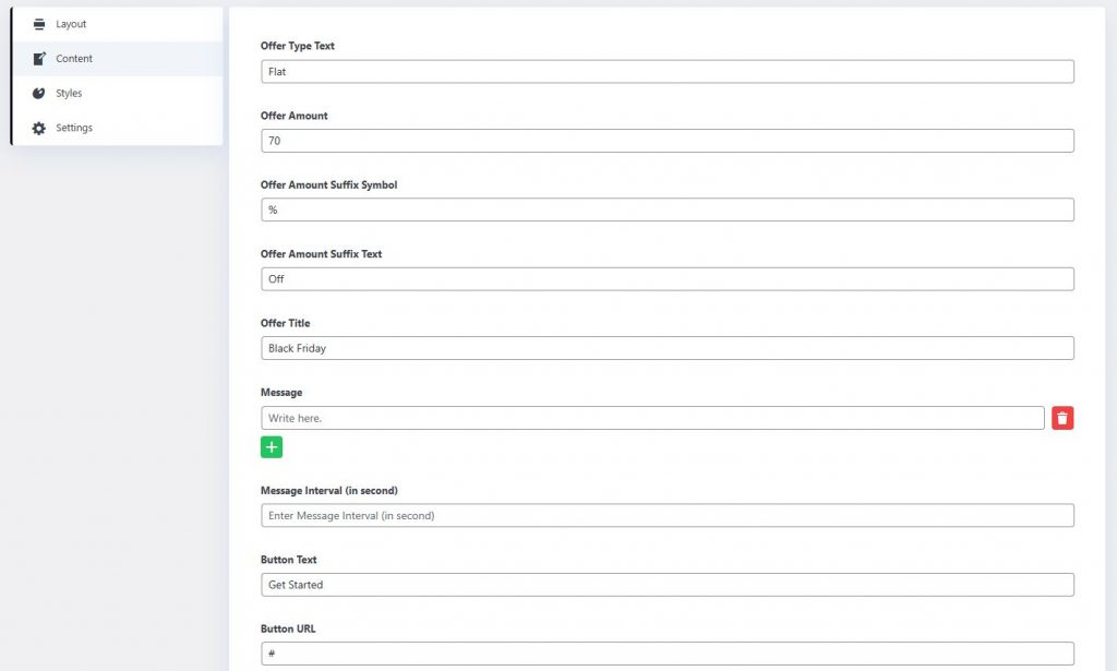
Step 4: Personalize the banner
Now you have to match your banner with your brand and your marketing strategy.
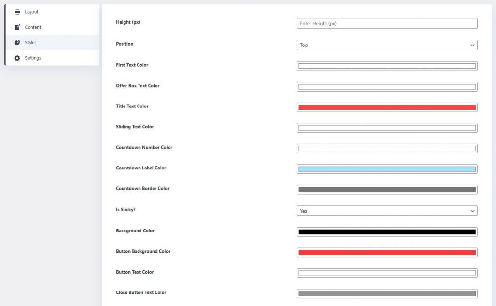
The menus on the right let you change all the shades of your banner. You can also select the height and position of the banner in this section.
Step 5: Apply the required settings.
In this section, you have to think about your planning.
- Do you want to add a start and expiry date of the sales offer you want to showcase?
- Are you going to display the banner on all your web pages?
- Will the banner stay hidden on the mobiles?
- Will you hide the close button? Or do you want the banner to close automatically after a few seconds?
- Do you want some delay before the banner appears?
- Will the banner appear in all the countries or only in the selected ones?
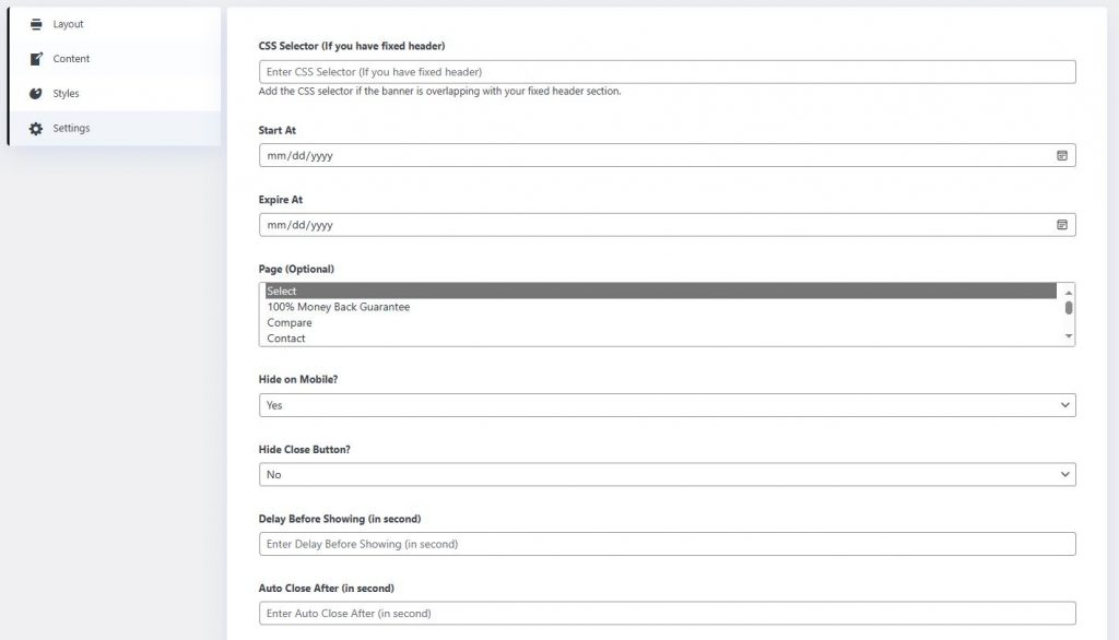
You can configure everything in this section.
As long as you know what you need, you can easily set all the options and create an impressive banner. Test all the templates, and colors to see how it goes.
Preview
Testing is one of the most important phases of banner design. Yet, a lot of website owners skip it. Do not repeat this mistake. Check what your visitors are going to see on your website. Make sure the banner looks encouraging and informative. Also, it should match the look and feel of your website.
If you want to design custom banners or if you are not using WordPress, you can try some other tools.
Canva: Canva is a simple-to-use graphic design application. It has a user-friendly interface, which is perfect for beginners. Moreover, this web-based application gives you thousands of templates to design marketing website banners.
Adobe Express: If you want to create impressive graphics for your marketing banners, try Adobe Express. It has a lot of tools to design incredible graphics. This web application is free to use.
Desygner: Similar to Canva, Desygner has a wide range of templates for your assistance. You can also add vectors to your banners. It also has a forever-free plan.
Tips to design an impressive marketing website banner
- Compress the media: If you want to custom design the banners using WordPress or Canva, do not use large images. Keep them within 150 KB. If you do not find a small image, then compress it. You can use a lot of free tools to compress images. Try web applications like Compressjpeg, iloveimg, or imageresizer.
Keep in mind, that small images load faster. Hence, the overall experience will be better for your visitors if you do not use big images on your banners.
- Create responsive banners: Around 70 percent of visitors browse over their smartphones. Hence, you cannot ignore the small devices if you want to increase your conversion rate.
- Keep everything simple: Do not create banners with multiple fonts, a lot of colors, or a variety of images. Otherwise, your visitors might feel distracted. A simple design with a clear headline one image or animation and a CTA button could be a great start. Also, do not use too many shades.
- Be consistent: As per your marketing strategy, decide the fonts, and colors you will use for your brand and its promotions. Keep all the elements similar in your website and your banner.
- Adapt to the trends: Keep checking your competitors and the latest trends to know what’s going on in the world of marketing banners. Stay updated. However, do not follow any of the ideas without thinking. Analyze whether it can be suitable for your business and your visitors.
Types of marketing website banners
- Fixed: The fixed banners are inbuilt on the website. Generally, these banners are placed at the top, bottom, or sides of the websites. These are the most popular banners as they never interfere with your visitors or force them to take action.
- Expandable: Expandable banners are also fixed, but they expand once you hover the cursor over them. They are also intrusive, but you can get rid of them by moving your cursor down. You can also close them.
- Pop-ups: Unlike the fixed banners, the pop-ups can appear anywhere while you browse a website. So, they do not have a static position. Moreover, these banners come out of nowhere, which disturbs the users. Therefore, these banners are intrusive and might hamper the overall experience of your visitors. You can use them but be careful.
FAQs
How banner strengthen your marketing efforts?
Banners can significantly strengthen your marketing efforts, especially if you design them properly.
- Increases the traffic: An informative and creative banner increases the number of visitors to your website.
- Target particular audience: You can use marketing website banners to target a particular group of buyers.
- Announce deals and offers: If you design an attractive banner, you can easily get more sales after announcing new offers, deals, and discounts.
- Showcase new products: Marketing banners let you advertise your new products or services without any trouble. You can also share the latest news about your business.
- Builds your brand image: You can keep the name of your consistent in the mind of your audience using banners. This practice is useful for new companies and also the established ones.
- Affordable: You can design marketing banners for free with the help of plugins like WPAnnouncement. The banner plugins are also affordable if you purchase one of them.
Should I use a subheading in the marketing website banners?
You can use substitute text if the headline needs an explanation. However, we recommend you keep the text to a minimum.
What is a call to action (CTA)?
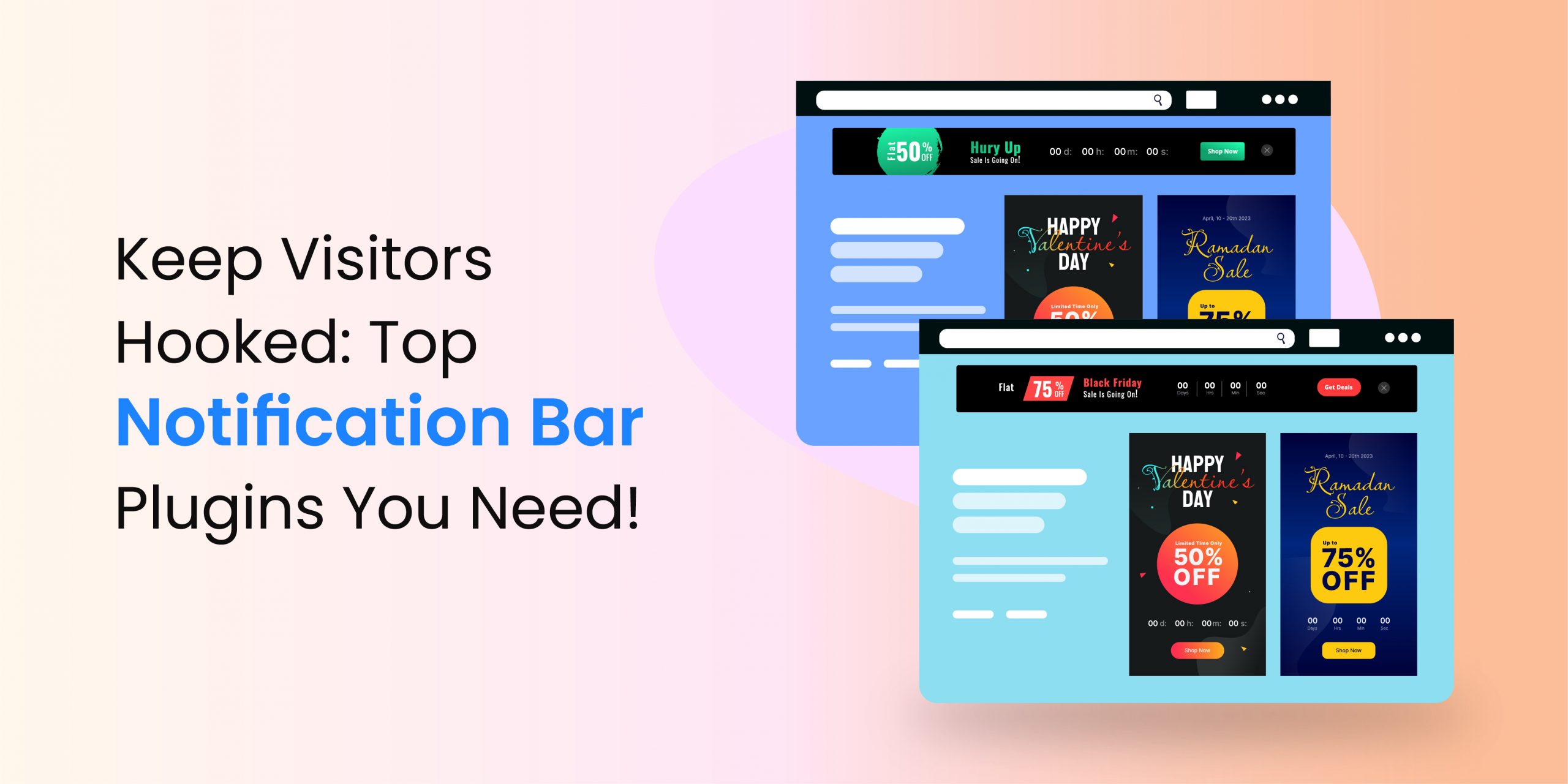
A call to action is what you want from your visitors. For instance, the banner in the given image has a CTA as Shop Now, which is lined with a different landing page or a web page wherein the flat 50 percent off products are available.

You have to use an effective CTA to make it eye-catching. So, use phrases like Get it Now, Learn More, Know More, etc.
Which is the best color for marketing website banners?
All the colors are different and they represent different emotions. You should choose the shade of your banners according to your targeted audience, something that can attract them. Also, prefer the banner to design like the color scheme of your business. You can be creative, but keep the style consistent.
Final thoughts
We hope now you know how to create a marketing website banner. Follow the suggested steps and you can develop effective banners, even if you are not a designer. Design visually appealing banners, which can instantly grab the attention of your visitors. Keep them relevant to your website. Above all, ensure our banners are easy to read and understand.


