Website banners are an excellent way to showcase important messages to your visitors. But, they can perform multiple other tasks apart from conveying your message. Let’s discuss why you should include a banner on your website.
An attractive website banner catches the attention of your visitors once they land on your website. After gaining their attention, the banners can show them the latest product and increase their sales. The notifications can also collect the email addresses of your visitors to help you convert them into your customers.
What is a website banner?
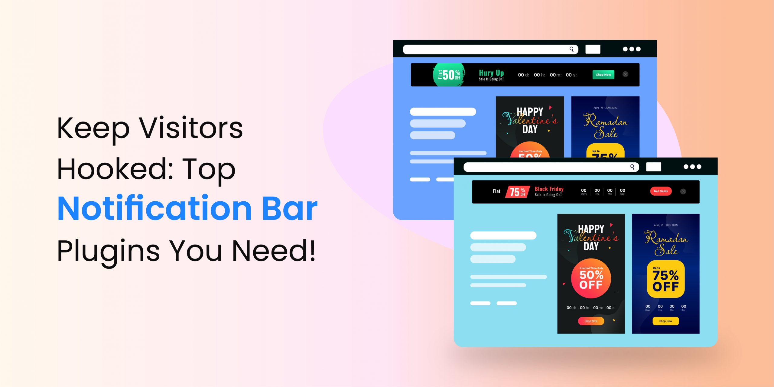
In general, a website banner is an offer to get more clicks and engagements from your visitors. You must have seen these notifications on a lot of websites. Remember something like, Hurry, Festive Season is here, Limited Time Offer, Subscribe Now, and more. You can also use the banners to announce the latest updates about your business.
Almost all the banners have a CTA button. Like the “Get Started” button.
Types of website banners
The banners differ according to the business and type of website. The most common ones are mentioned below.
- Strip banners: The strip banners are generally placed on the top or bottom of a website, right above the navigation bar or below the footer. Most businesses use such banners to announce their working hours and holidays. You might have seen a lot of such notifications during and after COVID-19. Almost all the organizations were using the website banners to notify the changes in their operating hours, delays in the deliveries, conditions to enter their official premises
, and more. - Slide banner: The slide banners also appear at the top of the websites. Generally, they are created using an image and some text. Such banners are commonly used for sales promotions, subscriptions to newsletters, calls to action to increase engagement, and more. You might have seen slide banners on multiple websites, under the main menu.
- Skyscrapers: Vertical banners placed on the sides of the websites are known as skyscrapers. Such banners can be fixed or floating. The common size of these notifications is 120 x 600px.
- Pop-up banners: Pop-ups are also considered a type of banner, especially if they showcase an important message or promotional content. The pop-ups appear once you surf a particular website for a few seconds or minutes. They can also come up once you open a website or are about to leave it, depending upon their configurations.
Why would you include a banner on your website? Are banners effective?
Banners serve numerous purposes. However, advertisement is their first responsibility. You can use them to highlight new products, and display offers or promotions. Hence, the number of users accessing these products or deals increases.
In addition, the website banners can redirect your visitors to specific pages, and social media platforms and strengthen your email marketing campaigns. Some of the benefits of using website banners are mentioned below.
- Sale boost: The banners attract your visitors by showing new products in style. You can also showcase the best-selling products. Once published, they redirect the traffic to these products. Hence, the conversion rate of your business increases.
- Enhances the overall experience: Communication is one of the most important pillars of customer satisfaction. Banners provide your potential customers with the required information in an attractive way and help them shop for relevant products.
Changes to your working hours, holidays, or any other changes in your operations could be frustrating for your audience, especially if they are not aware in advance. You can use the website banners to show the notice about any important updates. Hence, your visitors or customers know what is going on. Therefore, there is no confusion or frustration in their mind about your business.
- Easy to design: You can easily create a banner, even if you do not know coding. Once ready, uploading it is also a simple task. Hence, you can increase the engagement rate and revenue of your company even if you are not a technical expert.
Tips to create high-quality website banners
1. Visuals: Design attractive banners. Take it as a style quotient of your website that you need to change regularly. Also, keep the banner’s look and feel similar to your website. However, do not let it blend significantly. The banner should stand out.
2. Content: The text on your banner should be instantly readable. The font size of the headline and body should be different. The content should be equal to or less than four lines. Do not use script or cursive fonts. Avoid using small text size, all uppercase, and text size less than 10 pt. You can use small fonts for disclaimers.
A clear headline is crucial. Think about what you want to tell through the banners. Use relevant keywords. Do not use the slogan or punchline of your brand because it might not be descriptive.
3. Colors: Colors are very powerful in nonverbal communication. So, you have to be selective while choosing the colors for your banner. A lot of visitors might not buy your product only because of its color.
Men and women prefer different shades. So, it’s a good idea to understand a bit about colors, especially if you are offering gender-specific products or services. If your product or services is unisexual, prefer colors that feel relevant to your business or represent your organization.
For instance, social media giant Facebook, Lufthansa Airlines, GE, Ford, Dell, and LinkedIn use blue to emphasize comfort, stability, and trust. Similarly, black is generally used by luxury stores like Chanel Gucci and ShoppersStop. It’s because black is elegant, sophisticated, and glamorous. Yellow is friendly and cheerful.
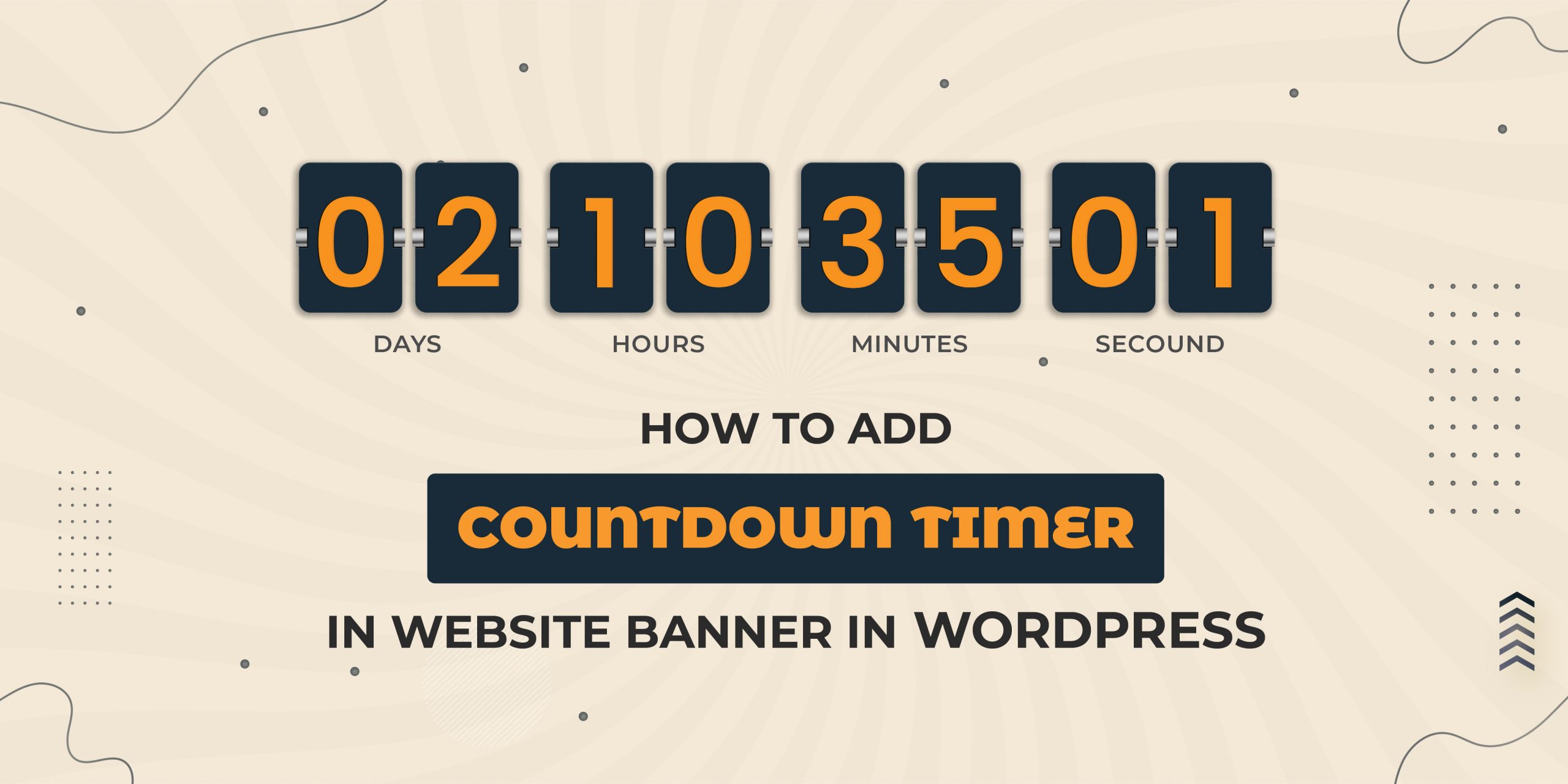
4. Offer: What is the motive of your banner? If it is sales, then include an offer with the website banner, except when you are making announcements or sharing some news. If you offer some discounts or deals, add a countdown timer to create urgency and induce fear of missing out (FOMO).
5. Call to action (CTA): Link the banners with particular pages, products, or product categories, so that the visitors can check everything in detail. Keep the CTA short and crisp.
6. High-definition media: The website banners should be visually attractive. Hence, it is crucial to use high-quality images and videos. You can also add animations. Animated banners overshadow static ones. But, make sure the animations do not distract the visitors from the message of your banner.
Prefer simple animations that do not last for more than 15 seconds. Also, do not loop the animation more than thrice. The last frame of the animation should be a CTA.
7. Keep things simple: Crowded banners are nothing less than a nuisance for your visitors. An effective website banner contains one or two images, minimal text, and a CTA. You might see a lot of banners without any text. They comprise an image and a CTA. If your banner has more than one or two sentences, it might not do well.
8. Updates: The interest of your audience increases if you update the banners with new announcements, products, discounts, or offers.
FAQs
What type of information can be displayed using website banners?
You can convey a wide range of messages with the help of banners. However, make sure you keep the text to the point. Do not use too many words. Otherwise, your message might be lost. We suggest you should use one or two sentences.
The information you can share using website banners are:
- Change of working hours of your business
- Public holidays when your business will not function
- Change of official address
- Delay in delivery, useful for e-commerce stores
- Reminders about anything
- New additions to the rules or conditions
- Offers, discounts, promotions and deals
How to make sure the banner gets noticed by the visitors?
Use original high-quality images in your website banners. You can try graphics if you do not have a relevant HD image or you are unable to design one. Animated GIFs are good, but do not use too many of them.
The text and graphics look good in bold colors. Also, include a call to action button to engage the visitors. Apply contrasting colors on the CTA to make it more eye-catching.
When to use the banners?
Banners are useful whenever you want to convey any message to your visitors. It could be anything like a new office address, working hours, a new policy, discounts, promotions, festive sales, latest launches, and more. For instance, there is a tradition of purchasing new products at Christmas and a lot of companies offer sales and discounts on this festival.
If own an e-commerce store, you can use a banner comprising a Christmas tree, Santa Claus, lights, and more relevant stuff. Include a pile of wrapped gifts as graphics. The recent pandemic was the best example. Almost all the businesses were using banners and notification bars to share relevant information.
Final thoughts
We hope now you know the importance of banners for your business. They take your visitors to specific pages to show the latest products, offers, announcements, or news. Hence, the banners attract traffic to your website and boosts the engagement rate of your business.
So, create a banner for your website by following the tips we discussed above. Write a clear headline, include CTA, pick high-quality images, and keep everything simple. Review it frequently and update it as per the conditions.


