Website banners convey your message to your visitors. If you design and use them properly, they can boost the sales revenue of your business. But, how to do it? Let us know everything here.
Whether your visitors browse your website on a smartphone, desktop, or tablet, banners ensure your message is displayed. So, you can get the attention of your potential buyers and promote your products, services, and spread important updates about your organization. Hence, the chances of driving sales for new services and the latest products become easy with the help of website banners. But, things can be simple if you know how to design impressive banners.
Type of information you should include with banners
Keep your message concise. Do not use too many words. Otherwise, your message might be lost among them. So, do not include more than one or two sentences on your banner. The most common messages for website banners are
- Chang in the business hours
- Holidays
- Address changes
- Delay in the delivery
- Reminders for the sales or offers
- Invitation to an event or change for entry conditions
- Latest products or services
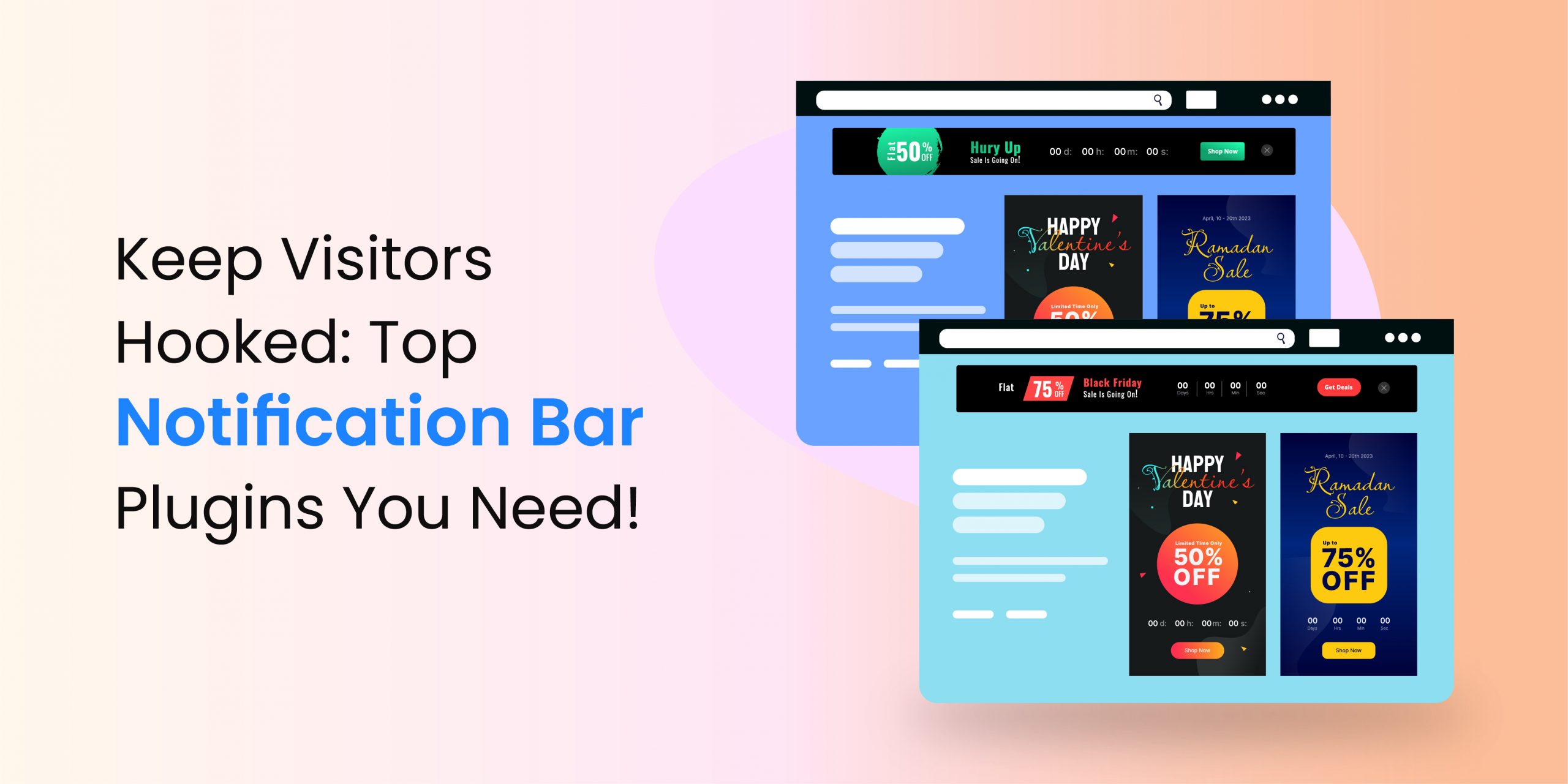
- Check some of the examples
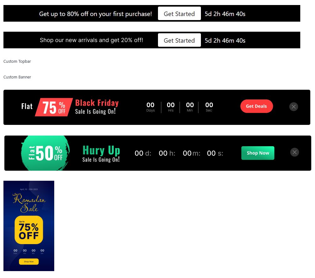
The banners you can see in the images are designed by WPAnnoucement. You can try it to design an impressive banner if your website is built on WordPress. This plugin gives you several templates to create the banners. So, the designing and publishing process is easy with its help.
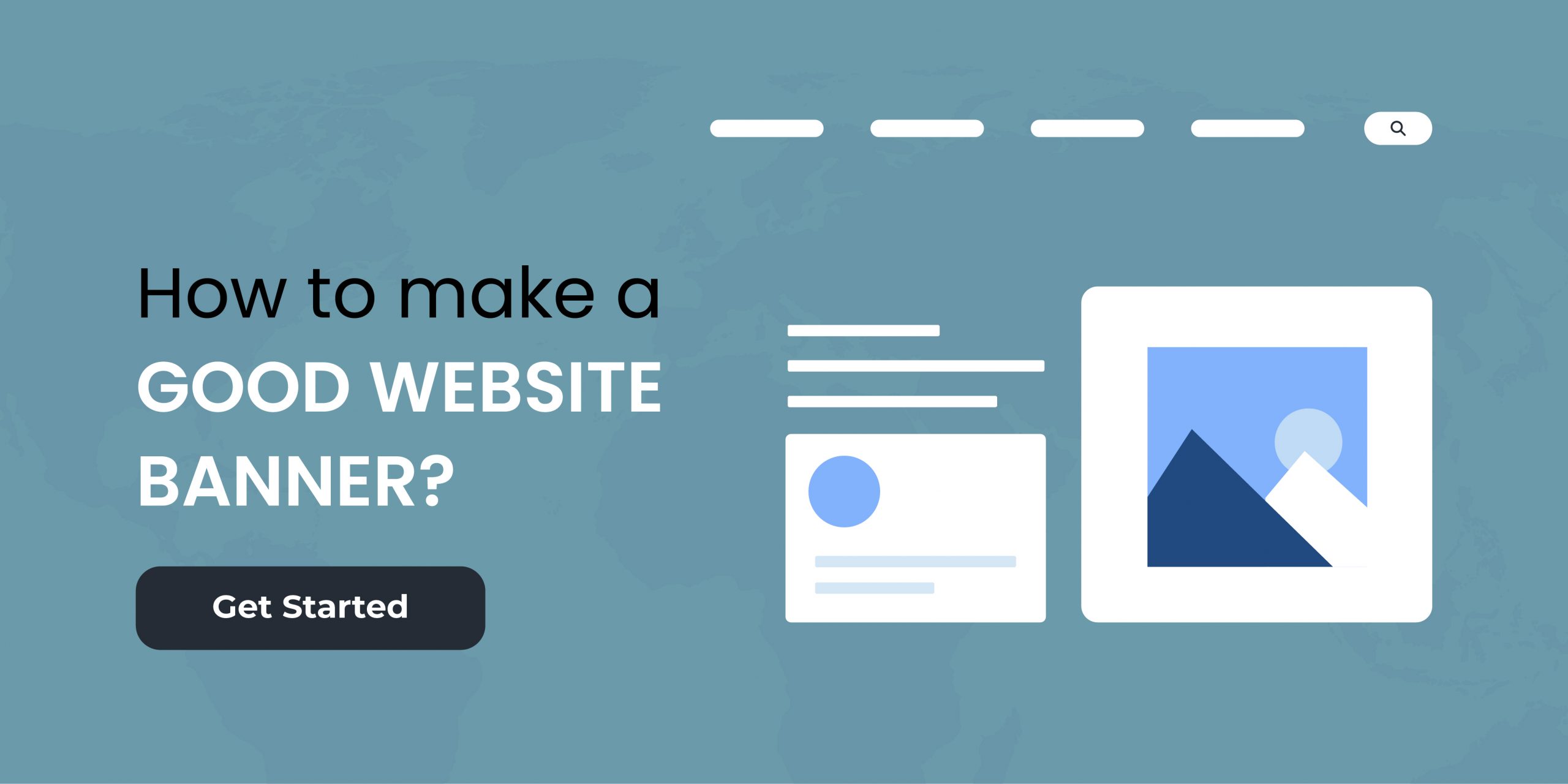
How to use website banners in website?
Website banners are a cost-effective method of promotion, but only if you design them as per the standards. Once you have an informative and visually appealing banner, link a particular web page or landing page with it. So that once your visitors click the CTA, they can reach the specific page where you have further details.
You can use the same strategy you developed for email marketing, social media marketing, or advertising, especially if the idea is successful. When you use your social media posts or ads as your website banner, it reinforces your message. Keep in mind, a good marketing has a cumulative effect on your target group of buyers. So, exposing them to more than one message increases the chances of getting better responses.
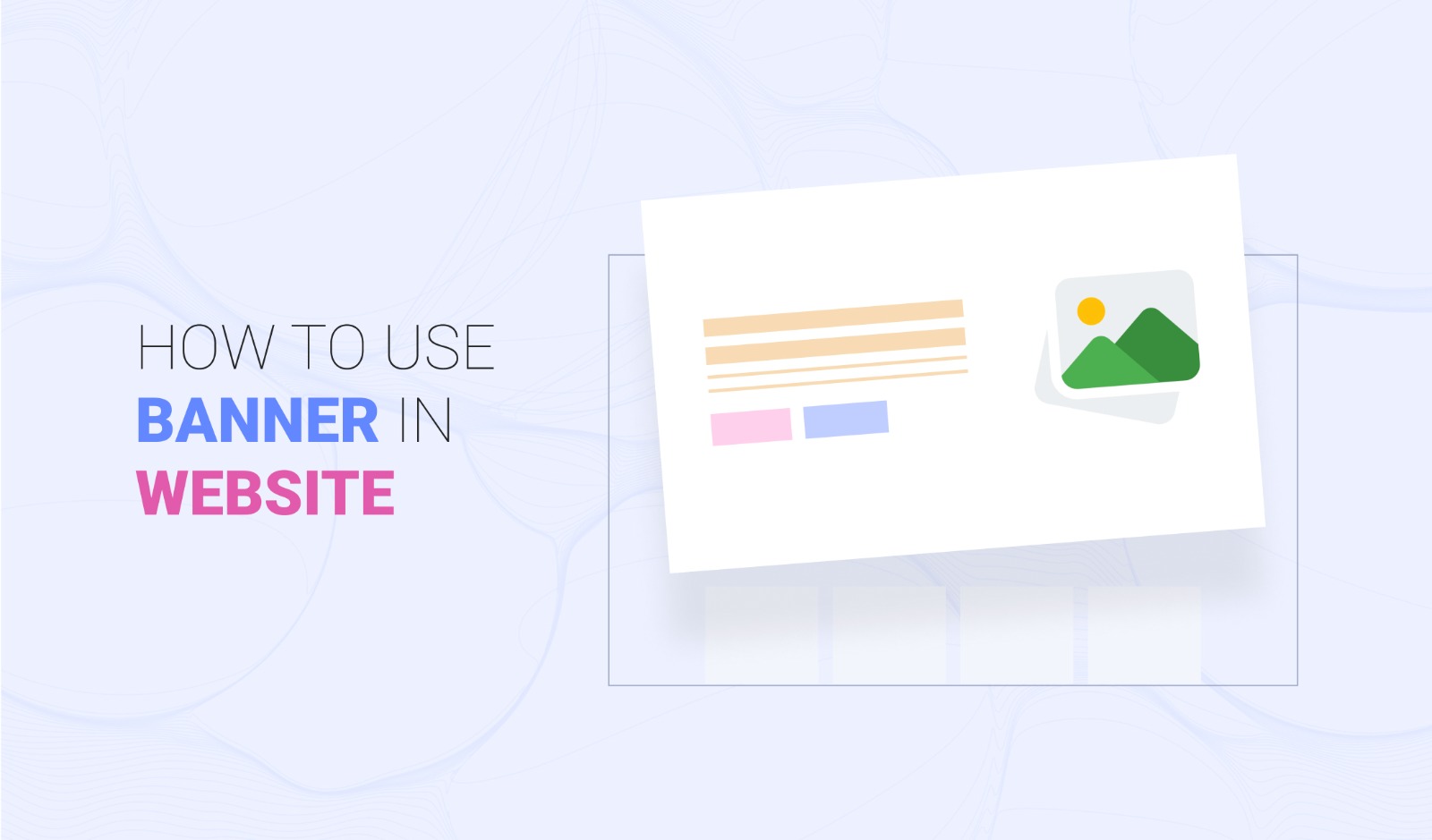
How to use website banners to promote products, services or events?
If you want to engage visitors to buy your services or products, design an attractive banner to promote what you have. Follow the given tips if you want to use a website banner to promote your business.
1. Targeting
Targeted banners give better results. So, segment your buyers according to their demography, interests, and behavior. Such factors help you to design visually appealing banners for your potential buyers. Once the banners are ready, you can also use them on niche websites, if you planning for advertisements.
2. Clear fonts
Make sure the visitors can easily read the content on your website banner. If the fonts are not clear, your potential customers might never click on the banner. Apart from that, choose a font that’s consistent with the other elements of your business.
A clear font makes your website banner more appealing. You can try something playful for children’s sites. But, stay away from italic, cursive, and scripting fonts.
3. Use the right keyword
Include relevant keywords in your headline. This step ensures your banners are easily searchable on search engines like Google and Bing. For instance, if you own an online shop for clothes, try something like Jeans for men, dresses for babies, formal shirts for boys, office trousers, and similar text. You can try Google Keyword Planner, KWFinder, or SEMrush to find relevant keywords.
4. Optimize image names and tags
Tag the image used in the banner correctly to rank higher on Google search results. The name of the images on the banner is an important part of SEO. So, do not save the photos with random names. Otherwise, none of the search engines will be identify your image and its relevance to your website.
5. Use prominent CTA
Your website banner might not generate the expected results if your visitors cannot take action. Therefore, you should make a prominent CTA button, so that it can catch the attention of your potential buyers and encourage them to click or do something else as per the settings.
In the given image, the CTA’s color makes it highly visible.
If you own an e-commerce business, you can use CTAs like Buy Now, Shop, Order Today, Pick, Add to Cart, and more. Similarly, non-profit organizations can keep the CTA as Support, Give, Adopt, Donate, or Volunteer. If you want to increase the number of subscribers, try Sign up, Subscribe, or Join.
6. Psychology of colors
If you want to use the banners to their full potential, focus on color psychology. You can pick shades according to your business and brand. However, keep in mind that different colors represent different emotions.
- Red – Love and excitement
- Orange – Sociability and confidence
- Yellow – Happiness and creativity
- Green – Quality and nature
- Blue – Peace and trust
- White – Simplicity and cleanliness
- Brown – Reliability and strength
- Black – Luxury, sophistication, and formality
- Purple – Royalty
7. Responsive website
Your visitors carry their smartphone wherever they travel. Hence, your potential buyers generally use their mobile for almost all their tasks, including shopping. So, more than 60 percent of your traffic comes via smartphone.
Therefore, you need a responsive and mobile-friendly website & banner. If the banner is not responsive, your visitors might not be able to see it unless they zoom in.
8. Updates the banners frequently
Perform A/B testing on your website to see which banner performs better. Improve the banners that cannot do well. In addition, updated them frequently. If your visitors keep seeing the same banner every time they visit your website, it’s not good for your image.
9. Use relevant banners
Now search engines can easily understand the content of your website. So, do not stuff keywords in your website or banners. In addition, the banners must be related to your website. For instance, if you own a digital marketing business, you cannot place a banner that talks about cheap flights.
10. Place the banner carefully
Effective placement of the website banners is crucial if you want good results. A poorly placed banner cannot grab the attention of your visitors, direct them to specific pages, or increase the conversion rate. So, make sure the banner is displayed prominently on your website.
11. Use small-sized media
Page loading speed decides the overall experience of your visitors. None of the online users prefers to browse slow web pages. Page loading speed is also a factor in search engine ranking.
Hence, use appropriate media in your website and banners. As per Google, the maximum size of a banner should be 150 KB. Follow this limit to make sure your banner loads quickly.
Rules to get the best results from online banner advertising
If you want to use banners for advertising, then follow the given rules consistently for better outcomes.
Ad positions
Include two to four banners per page. Place them in different positions. However, do not try to include more than four banners. Too many banners are overwhelming for the visitors and can also slow down the website. Search engines degrade the rank of slow websites.
Ads on the top of a web page perform better than the ones at the bottom. We suggest you experiment at different positions to see the best possible results.
Creativity
You have to spend some time designing creative and impressive banners. Online users browse around one hundred websites every month and see a wide range of banners. So, you have to ensure they feel attracted to your banner and remember it for longer.
Design a simple banner. Do not include more than three or five elements. Too much text is not advisable because none of your visitors has the time or patience to read everything. Also, check which element is dominating your banner.
For instance, if you have a banner with a logo that’s larger than the text or photo, what will the visitors notice first? Naturally, they will see the logo. So, keep the logo small if you want your potential buyers to focus on your ad, its text, and related images.
Contrast
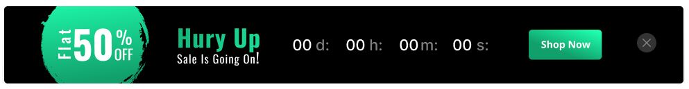
Well-designed banners have strong contrast because human eyes are automatically drawn to them. So, you can encourage your visitors to take some action by utilizing contrast properly. For instance, the CTA should be created with a color that’s opposite or far apart from the rest of your banner. Like, black and white combination in the given image.

Other tips to use banners correctly
- Keep the banners similar to your website: Make sure the design of your banners does not conflict with the website.
- Use relevant images: The product or services on your banner must match the images you are adding to the banners. Otherwise, the visitors might feel confused.
- Test the banners: A banner comprises multiple elements including font, color, image, CTA link, videos, animations, and more. So, you should check how they appear on your website. You must review it at different locations on the web pages to see if everything looks good or if you need some changes.
- Brand your banner: Include your logo in the banners, especially when you are advertising. People tend to forget, and without the logo, they might not recognize your business.
- Be creative: The designing world is limitless. You can follow our tips but also try to be creative. Try to think out of the box and also let us know in the comments below.
Final thoughts
A well-designed and visually appealing banner can increase the engagement rate and improve the conversions of your business. Moreover, website banners are also helpful in increasing the sales of your new launches. You can try WPAnnouncment to create impressive banners and drive better results. Download the free plugin here.