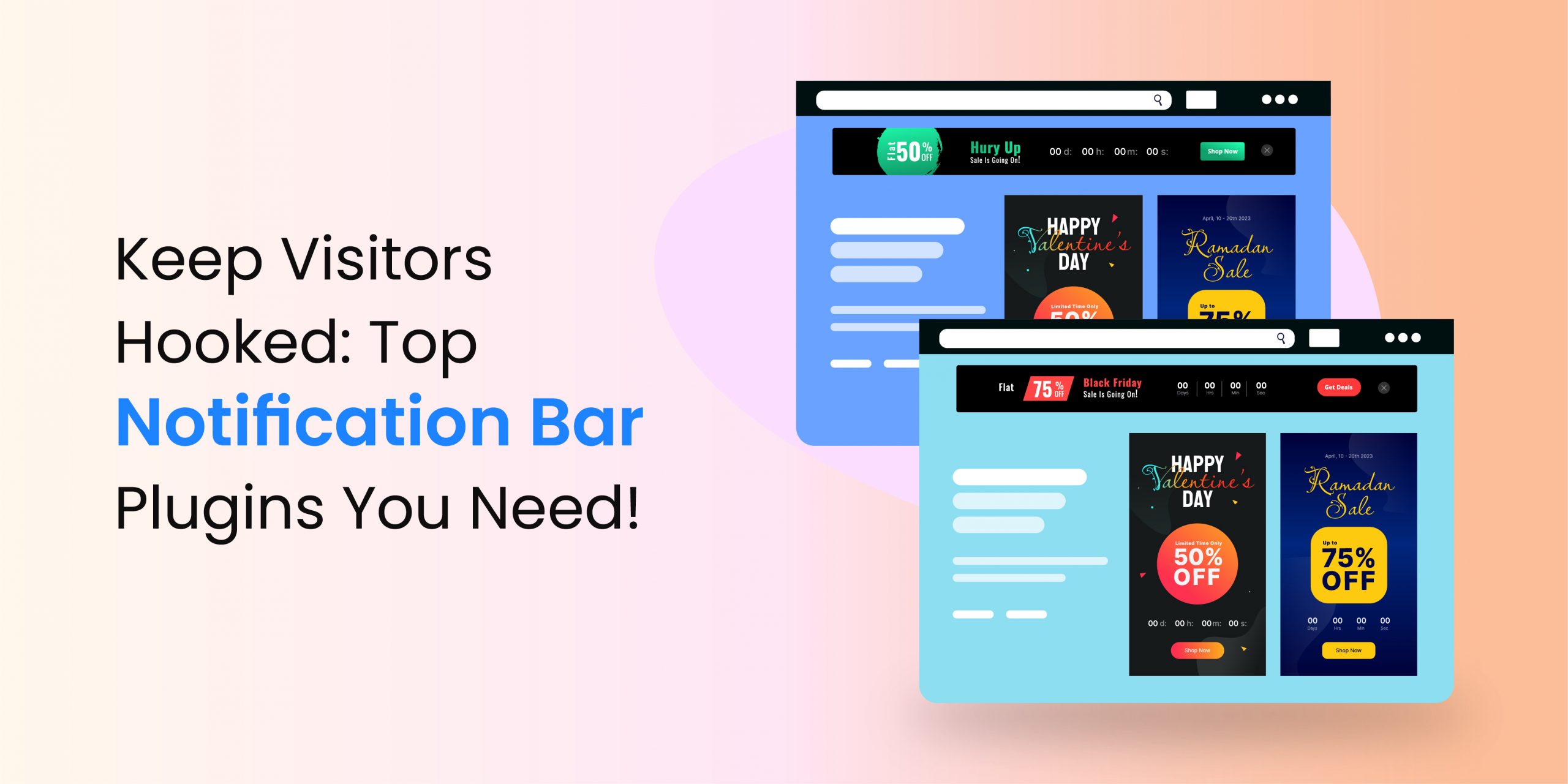
No matter what your business is, an attractive website banner with simple text and striking colors could be an excellent addition to your website. You can see banners on almost all websites nowadays. Walk down any street on the internet and you will see almost all the websites use banners. So, how can you make sure your audience notices your banner?
A perfect banner does not appear by chance. You have to make it strategically. Let’s discuss some tips to help you make incredible banners for your website.
How to make a good website banner?
1. Understand your motive
Why are you creating the banner? What do you want to accomplish with its help? You can design an attractive banner, once you know your purpose. Some of the possible objectives could be:
- Increases brand awareness among your audience
- Highlight new products or services
- Promote sales or discounts
- Sharing an upcoming event
- Create awareness for a social cause
- Rebrand your organization
We gave you some common examples, but the banners are limitless. Once you know what you want to achieve, your goal directs your design process.
2. Identify your audience
Who are your potential buyers? It’s an important factor to consider. If you already made your customer profile, move to the next step. If not, create a buyer persona. Once you have a clear idea of your audience, you can visualize your buyers, which helps you to design website banners accordingly.
Identification of your audience maximizes the success chances of your banners. Your buyers pay more attention to your notification if it’s designed according to their taste. Hence, you can maximize the conversion rate of your business.
3. Brainstorm ideas
No matter whether you are working alone or with a team, start thinking and brainstorming. You can take guidance from experts, especially if you know someone. Write down all the ideas until your brain goes dry. Eliminate the ideas you do not like.
There are no good or bad ideas, so write down all of them one by one. Select the one you like and then, make some sketches about how the banner will look. Also, think about its location.
4. Use the surroundings
Once you know the purpose of creating a banner and you have an incredible idea, think about its location. Where are you going to place the notification? Will you put it on the top, bottom, or sides of your website? The location of your banner is important for multiple reasons, but here we are talking about its surroundings. The banner must stand out to get the attention of your visitors.
Paying attention to the backdrop and surroundings is crucial while designing a website banner. For instance, you might design an eye-catching notification bar with attractive yellow, red, and purple colors only to find out that it sits on a red background. Hence, the banner gets lost due to a similar shade in its backdrop. In this situation, you should prefer green or blue instead of red, yellow or orange.
5. Select the shades wisely
Colors are not only about filling the banner. You can convey the right message if you use the right colors. You might not believe it, but people create an opinion about products within around 90 seconds. Their opinion depends a lot upon the colors you choose.
Color preferences differ from person to person. But, a lot of colors affect the perception of people in general. For instance, green is associated with money and the environment in the USA.
So, what are the best colors for your banners? Well, the answer depends upon your motive and what type of impression you want to convey. For instance, if you are creating a banner to make your name, use the colors present in your brand’s logo.
6. Be consistent
Consistency is important when you design website banners. The banners should follow the design, theme, and language of your website. In other words, the tone, style, and content of these notifications should be similar to your brand if you need more clicks.
7. Use high-quality media
Whether you use an image, photograph, graphic art, video, or animation in your website banner, it should be of high definition. A lot of business owners make the mistake of using low-quality and blurry media on the banners, which does not make a good impact on the visitors.
If you are using an animated video, it should not be longer than 15 seconds. You can keep the video in a loop, but not more than three times. Include CTA whenever your animation ends.
8. Readable text
Make sure the text on your website banners is easy to read. Do not only think about the font size. You also have to take care of the font type you use. Some fonts, especially scripts are tough to read.
Do you think your visitors will stop and spend forever to read your banner? They might only look at it for a few seconds. The banner might not be able to attract your potential customers within such a short span.
How the visitors will engage with the banner if they cannot even read it? So, pick a classic font without too much styling. Use bold text if the words seem to be thin.
Also, keep your content concise and to the point. No matter you are designing a small, medium-sized, or big banner, you have to keep its text crisp. You must convey your message in short.
9. Include CTA
Call-to-action buttons increase the click-through rate (CTR) of your website banner. Use contrasting colors to highlight the CTA.
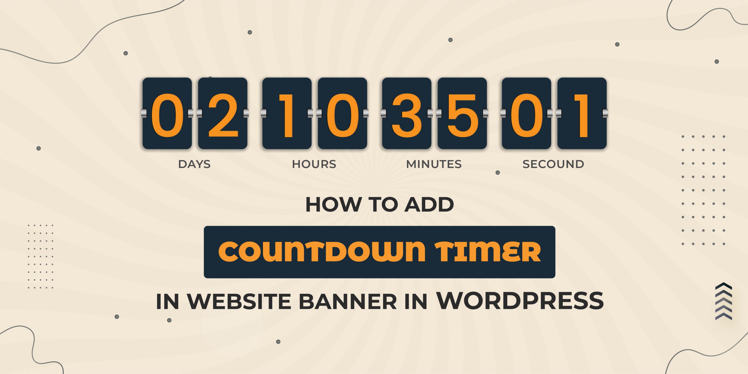
10. Create urgency
If the purpose of your website banner is sales, then deploy FOMO (fear of missing out) to create urgency. Place a deadline using a countdown timer.
11. Clear focal point
Your website banner needs a clear focal point, especially if you are designing a large one. You have to hope that the visitors read your entire banner. However, what if they glance at it? In such cases, you need to tell them what and where to look.
The focal point could be a statement, word, your logo, or an image. You can put your focal point in the limelight in multiple ways. Some of the methods are given below:
- Contrast: Use bold colors on the text or image you want to use as the focal point of your banner. You can surround the text or image with white space to make it pop.
- Stress test: If text is your focal point, you can bold, capitalize, highlight, or underline it to draw the attention of your visitors. Almost all online users know that an underline or bold text is important to read.
- Make it large: You can also make your focal point larger than other elements on the banner. Large text or images gain more attention than their smaller counterparts.
While determining the focal point, you do not have to worry about the other parts. The focal point only acts as a hook to get the attention of the individuals visiting your website. Once you have their attention, they will look at all the parts of your banner.
12. Keep it simple
Your website banner should be simple. Do not use a lot of images, text, videos, graphics, or animations. Otherwise, your original message might get lost among them and none of the visitors might feel attracted to the banner.
13. Size
Do not think that only a big banner can attract your visitors. You should try and catch their attention without blocking the content on your website. Also, you should use the standard website banner size. The top-performing banner size for website are
- Medium Rectangle – 300×250
- Large Rectangle – 336×280
- Large Mobile Banner – 320×100
- Half Page – 300×600
- Leaderboard – 728×90
Apart from the overall banner size for website, you should also consider its file sizes. If your banner has significantly sized media files, your visitors might miss it. Because they will scroll or leave your website even before the banner loads. So, keep everything less than 150 KB.
14. Stay within the lines
The borders of a website banner are as important as its design. Hence, the banners must have clear borders, so that the visitors do not mix it with the main content. The borders also attract the individuals visiting your website.
Humans are naturally attracted to elements within a frame. So, use a frame around the banner to keep it separate from the rest of your website.
15. Responsiveness
In today’s world, the smartphone is the king and it will stick to this position for many more years to come. So, most of your visitors use mobile to view your website. Therefore, your banner should be responsive. In addition, its fonts should be clean and crisp.
16. Do not try and test
Website banners do not contain a lot of elements. But, don’t think they are easy to design. Also, a banner is the first thing visitors see on your website generally. So, it should look good and attractive. The banner designing process needs time and investment, which you should take very seriously.
You might feel tempted to join some pieces and create a banner yourself. Or you might hand over this task to one of your juniors or secretary. But, this is not the right approach. You need an expert working on your banner, especially if you want to get the best out of it. Or you can try one of the best plugins or extensions to create a banner for you.
Unfortunately, hiring a full-time in-house designer could be expensive, especially if you do not need a lot of creativity in your business. You can hire someone from Freelancer, Fiverr, or UpWork. Or, you can use an application to design the banner. For instance, you can try WPAnnouncement if you have a WordPress website.
17. Make sticky banners
When you publish a sticky banner on your website, it stays there even if the user scrolls down. On the other hand, if you place the banner at the top or bottom, visitors can hide them. But, not if the banner is sticky.
How to make a good website banner using WPAnnouncement?
Download the WPAnnouncement plugin from its website. You can try the free version and then upgrade to the premium edition. Once downloaded and installed activate this extension. Then, follow the given steps. So join now website banner design via WPAnnouncement.
- You will see a new option of Announcements on the left menu of your WordPress panel. Click on it and select Add New.
- Click on the first option, Layout, and choose a layout from the given options.
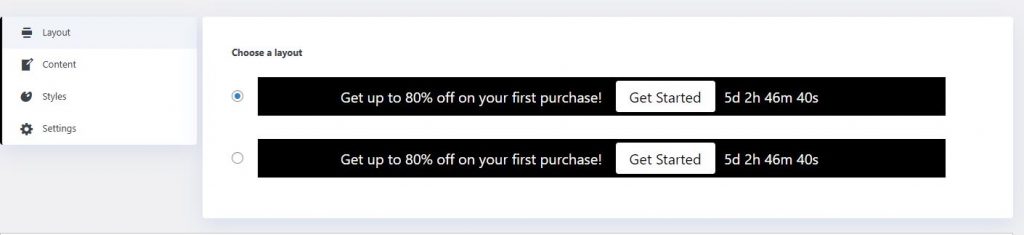
Select Content and change the text, Button text, and Button URL as per your needs.
- Click on Styles and then, Settings to make other changes including height, color, text color, text font, etc.
- Click on Save Draft and Preview to see the final design. If you think the banner looks good, publish it.
FAQs
How to choose the right background for your banners?
If you have individuals or products to show in your banner, you should select a solid background. You can convey your message without distractions using such a backdrop. On the other hand, if you are not including any physical products in the banner, try an image backcloth. You can also use a photo if your content is ready and you think the image can illustrate your message better. For a hotel banner for website, a carefully chosen scenic image or elegant texture can enhance the overall aesthetic while staying relevant to your brand.
How to write a catchy headline for the banner?
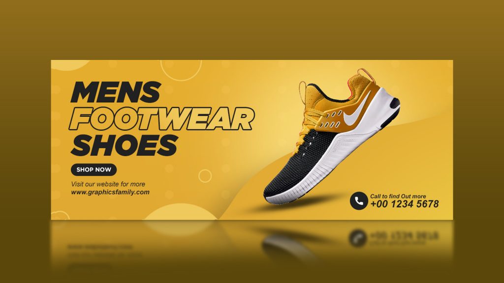
Sometimes we notice that website owners try to accommodate a lot of information in their website banners, which is not a good idea. A crowded, disorganized, and messy banner cannot perform well. Take a look at the given image

What do you notice? This banner communicates the message by using one or two lines. So, follow the given points to write catchy text for your banners.
Keep your headline short and crisp. None of your visitors has the time to read long content. If you are unable to convey your message within two short sentences. You have to work more.
Your statement should be clear. Your banners cannot be like an elevator. What is your message or offer for your visitors? What should they do after reading your text? These are the two questions you should answer while creating a banner. Use words like Go, See, Celebrate, Come, Join, Subscribe, etc. Ask your visitors to act.
Are sub-headings important for the website banners?
Subheadings are a sentence or two that rest below the headline. If you want to explain your headline or add a punch line to make it effective, you can add more text to your banners. However, make sure the sub-heading is clear to read and does not disturb or overshadow the CTA button.
Do not use too much text in your subheading. Add one or two words because no one is going to read everything.
What is CTA and how to make a good one?
CTA is a call to action, which means what to do next. It is the action you want your visitors to take once they see the banner. CTA has two parts – color and text. We need to discuss both parts for better understanding.
Color: You might not believe it, but changing the CTA color can increase the results up to 100 percent. Do you know how? The human brain responds differently to different colors because of our psychology.
- Red – Simulating, passionate, and vibrant
- Orange – Energetic, fun enthusiastic
- Yellow – Friendly, warm and cheerful
- Green – Natural, peaceful and healthy
- Blue – Trustworthy, responsible, and secure
- Pink – Calm, feminine and loving
- Purple – Successful, royal, and wise
- Brown – Earthy, simple and dependable
- Black – Exclusive, luxurious, and prestigious
- White – Pure, practical, and innocent
So now, if you own a restaurant, which color should you use as a banner background? Perhaps, you can use blue because as a food provider, you should be trustworthy, responsible, and secure. What about CTA? You should use the exact opposite color of blue, which is yellow.
Practically and psychologically humans can easily spot a visually opposite color. Hence, your visitors easily spot the CTA and click on it.
Text: What do you want your visitors to do? Answer this question while creating the CTA text. For instance, if you are a betting company, what should be your CTA? Play now or Bet now.

What if you are an online store? What should be your CTA text? Shop now or Buy is the most common answer.
And if you are selling digital products or complex services, you can use text like, Know more, Learn more, etc.
Final thoughts
After reading all the tips we discussed, we hope you know how to make a good website banner. Your banner is the first thing your visitors see. So, it should be visually appealing to increase the click-through rate. Also, the design of your banner should match the look and feel of your brand to ensure consistency.
Use a plugin or extension if you want to design the banners easily. WPAnnouncement is one of the best WordPress plugins to design banners for your website. It comes with pre-designed templates. You can customize them as per your needs. You can also add custom designs.