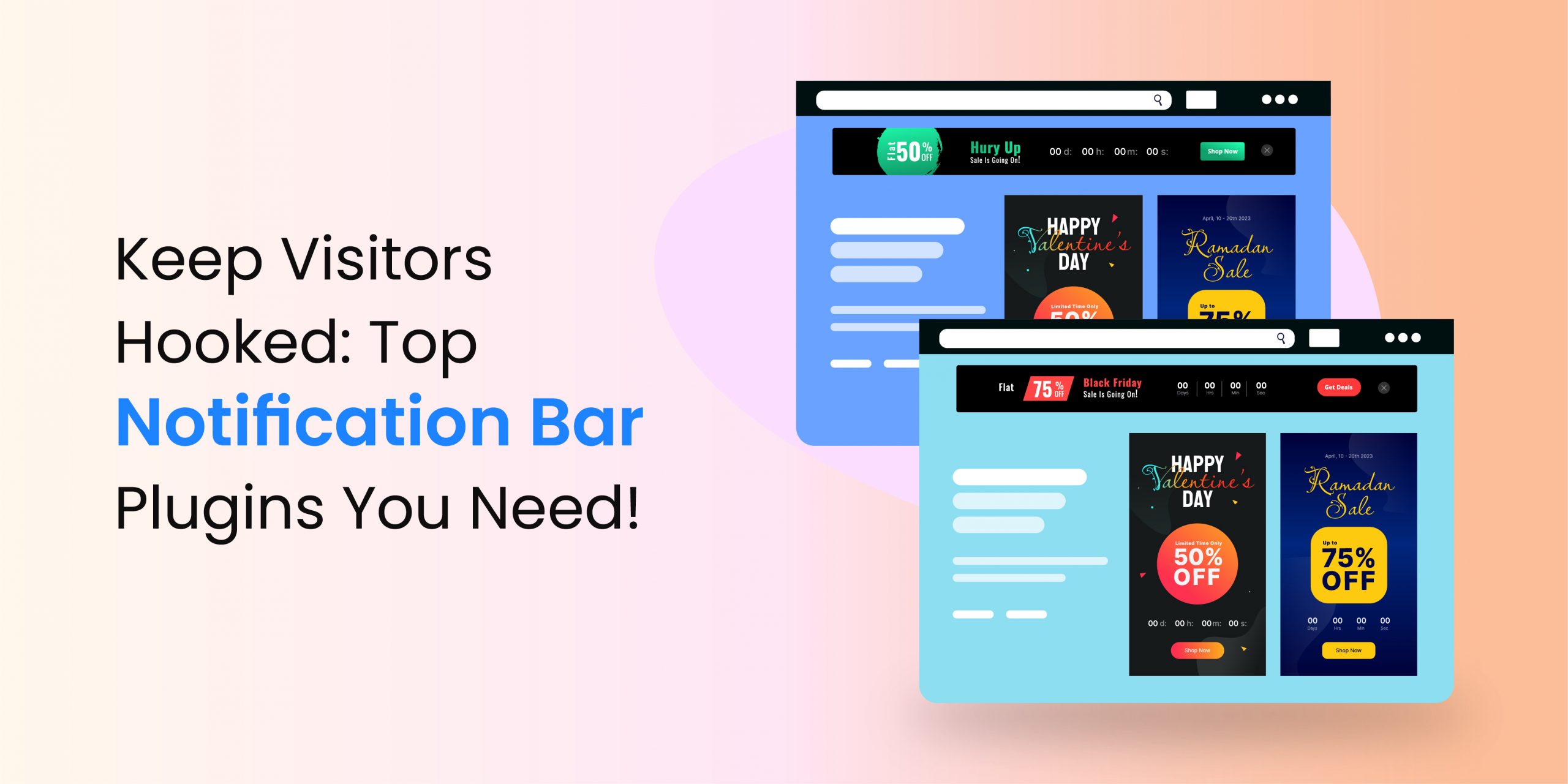
A website banner is a type of digital advertisement shown on the webpages. You must have seen rectangular and square-shaped ads on the left, right, top, or bottom of the websites you browse. You can create web banners or banner ads on your website or third-party websites like blogs, news portals, e-commerce stores, etc. Such display advertisements are useful to create awareness among your audience, drive traffic to your website, and boost your revenue generation.
How do website banners work?
Website banners capture the attraction of your potential clients. It helps you promote your products, offer discounts, or make other announcements. So, whether you want to create awareness about your brand, get more clicks, or drive traffic, website banners are effective.
The web banners are either static or dynamic. They direct the visitors to a specific page if placed on your website. If you put the banners on any other website, they redirect the visitors to your website.
Web banners are generally created using the company’s logo, punch line, new launches, call to action button, or discounts. But, they also comprise text messages, images, animation, or any other element that can capture the consumer’s attention.
Types of website banners
You can use several types of website banners to promote your website or products. Let’s know about some of the most common banners.
- Static: Some text and static image is the identification of static banners. Such banners are generally visible on sites with less traffic. The websites that have not been updated for a long time also showcase static banners.
- Animated: Animated banners are complex because they contain several images or videos or both. The animation can easily draw the attention of the visitors. These banners convey a lot of messages within a short period. Generally, animated banners are available on high-traffic websites.
- Interactive: An interactive banner asks the visitors to answer questions, click on any button, or play games. In other words, it keeps them engaged and hence, perfect if you want to improve the user engagement on your website.
- Expandable: The expandable banners are small, but you can expand them. Click on such a banner that shows you a lot of new information and tries to engage you in a conversation or redirect you to a different page relevant to your search or requirements.
- Rich media: Use rich media banners on your websites if you want to offer an immersive experience to the viewers. Such banners are the most complex as they contain games, 360-degree models, videos, images, animations, or any other interactive element.
- Transitional: Transitional banners appear when the page loads and then vanish automatically after some time. You can also close them straight away. Generally, these banners contain images and text.
- Pop-up or triggered banners: The automated pop-up generally appears when you try to leave a web page, hover over a particular section, click on a link, reach any specific point, and other similar situations. These banners close automatically if you click anywhere on the screen.
What to include on a website banner AD?
You can easily understand that a website banner has to be visually attractive. Otherwise, no one will click on it. In addition, the banner should contain crisp and easy-to-understand text. But, the most important part is relevance. The web banners should be displayed on your website and other relevant platforms so that your targeted audience can see them. Follow the given points to create a stylish website banner.
- Write a headline that can easily draw the attention of the visitors.
- Information about the banner, what is it all about.
- An attractive image or some other graphic.
- Call to action button. For instance, “Click here to get a 30 percent discount on your first booking”.
- Links that contain more information.
How much website banner cost?
The total cost of website banners depends upon two factors:
Designing: Creating a website banner is not expensive. You can either design it yourself or hire an expert graphics designer. You can design the banner for free by using WP Announcement, but it is only for WordPress websites. Using this plugin is very easy. For other platforms, you can try Canva, Visme, or Adobe Express.
If you want to spend extra money on designing, then you can hire a designer from Freelancer, UpWork, or Fiverr. You can get high-quality banners for $30.
Advertising: You can take out the second part if you need the banners for your business website. If you want to advertise your website, the cost per click of web banners varies from 4 cents to $1.49 on Google Display Network, 94 cents to $12.07 on Facebook Display Ads, and 91 cents to $2.88 on Microsoft Audience Ads.
Is rotating banner better for the conversion rate of your business?
You might know about rotating banners if you are a designer. Such banners contain multiple content pieces, which is great. You can convey several messages simultaneously at the top, bottom, left, or right side of your website. So, what could be the problem?
Rotating banners are not good for your conversion. Why? Check the following reasons.
- Slider increases the loading speed of your website, which is bad for the overall experience of the users.
- Your messages get lost in the river of content. Talking about five different topics on a single website banner is not a bright idea. Is it?
- Sliders do not work on a lot of smartphones, which is a huge problem because almost 60 percent of users view online content on their mobiles. So, it’s better to design a banner that works on all the devices.
- People are impatient. And you know it. Don’t you? Have you ever waited for the sliders to load on a website? You know the answer now.
- Website banner is not a good area to experiment. Online users might leave your website if they do not find what they need on your banner. None of them might wait for the next slider to load. The rotating banner or similar content is beneficial if you use them in your email and social media posts.
Website banner designing tips
- Keep your text concise and to the point.
- Do not use stock images in your banner. Avoid using fake images as well.
- Include a CTA according to your goals and relevance with the visitors.
- Choose an appropriate size and location as per your website.
- Do not use rotating banners, unless you have a significant brand understanding like Samsung and Apple.
Other FAQs
How to make a good website banner?
A high-quality banner must include your business logo, a message, and a call to action button. You can use buttons like Subscribe now, Buy today, Call for demo, or set up click to call. Prefer bold colors for the text. Apart from these elements, you can use attractive images.
Check the following points before you design the banners.
Outline your objective. What the banner should look like? Which message you want to convey? What is the action you want from the visitors? For instance, if you are an e-commerce store, you might want the users to purchase your products. So, you can use CTAs like, Shop Now, Buy Now, or Get it Today.
Identify the audience: Once you have the goal of creating the banner, think about your audience. Who is going to see these banners? Design them according to the mindset of your visitors.
If you are on WordPress, follow the given steps to design a website banner.
- Login to your WordPress admin panel.
- Download the WP Announcement plugin from its website, upload, install, and activate it. After activating it, you will see a new Announcements option on the left menu.
- Click on it and select Add New.
- On the next window, select the layout, content, style, and settings. Click on Save Draft and Publish.
- That is it, the banner is published on your website.
What is the best tool to build a website banner?
The first step is to know the timing to activate the banner on your website. You can try tools like Semrush and Google Analytics to understand the traffic. Once you do the required research, use WP Announcement to create visually attractive banners. If you are not on WordPress, try Canva.
Are website banners beneficial?
Website banners are one of the best ways to attract the visitor’s attention and sell your product or services. Hence, the banners are also helpful in increasing the traffic of your website, especially if you use them on third-party websites. You can check the click-through rate of the number of impressions your ads are getting. High CTR means the banner is effective and beneficial for your business.
How big the website banner should be?
The size of your website banner depends upon the content of your homepage. For instance, if you offer a wide range of products and services, you should use a small banner that can tease the visitors. You can also use an expandable banner in such cases. On the other hand, you can use banners of any size if you have only a few products or services to offer.
Final thoughts
Website banners are digital advertisements comprising text, images, videos, and animation. You can use them on your business website or third-party platforms like blogs or news sites. The banners are an affordable method to build brand awareness and start marketing strategies to increase your sales revenue.
Design a visually attractive banner if you want it to be effective. You can create eye-catching banners with the help of WP Announcement. You can also consult expert designers on Freelancer, Fiverr, or UpWork. Using WP Announcement is better because it comes with a free plan. The premium editions of this plugin are also affordable.


